Math skills for chemistryGraphs (M3)

Graphs (M3)

Learn to plot and interpret graphs, gradients, areas and log plots, applying rates of change and modelling in chemistry.
11 min

A relationship between two quantities is proportional if one quantity is simply a multiple of the other. Any graph of this would show a straight line through the origin.

The equation of this graph would be , where is the gradient of the line and is also the constant of proportionality. For example, in the green and blue lines below the gradient is .
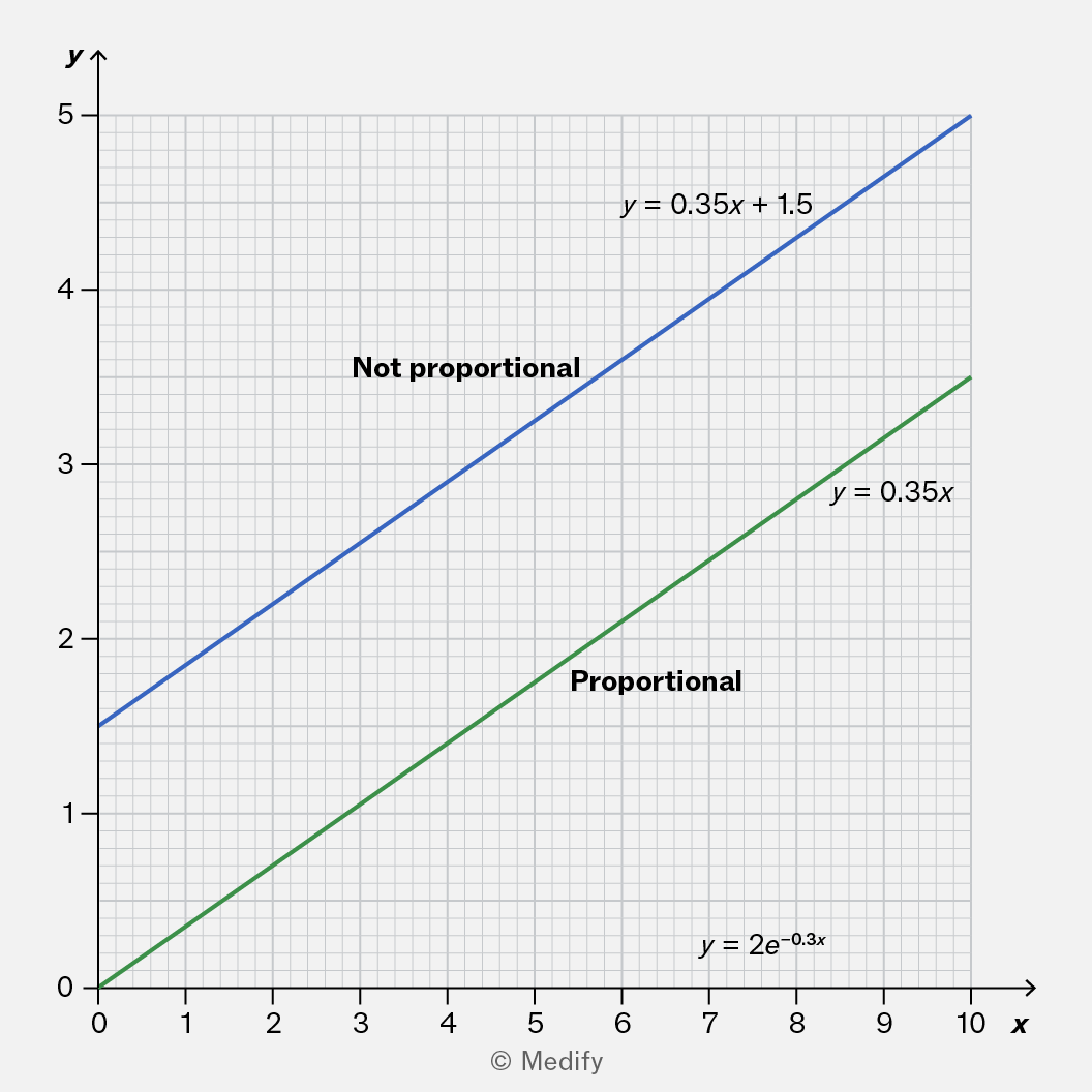
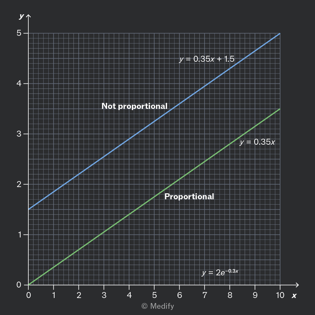
A graph displaying two lines: the blue line labeled 'Not proportional' represents the equation y = 0.35x + 1.5, while the green line labeled 'Proportional' represents the equation y = 0.35x. The graph has a grid background with x-axis ranging from 0 to 10 and y-axis from 0 to 5.

Graphs of the form are also straight lines. But unless the -intercept is zero, the line does not pass through the origin, and the graph does not show proportionality.

Add to favourites

Most straight-line graphs should be written in the form where is the gradient.

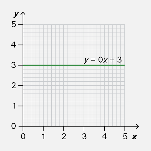
If the gradient is zero, it means that remains constant: it never changes.

In this case, which is better written as Keeping things simple with equations makes it easier to check your work and more quickly wrap your head around what comes next.
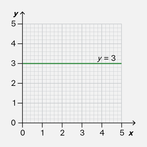
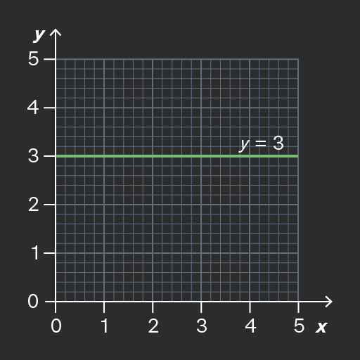
A Cartesian coordinate graph showing a horizontal line at y=3, spanning from x=0 to x=5, with grid lines in the background.
Do

Write the equation of a constant graph in the form

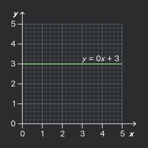
A Cartesian coordinate system with a horizontal line representing the equation y = 0x + 3, intersecting the y-axis at 3. The grid extends from 0 to 5 on the x-axis and 0 to 5 on the y-axis.
Don't

Include unnecessary terms such as in the equation of a constant graph.

Add to favourites

Graphs are for communicating information to other people, so clear labelling is crucial.

Always remember to include a brief title for the graph, and axis labels (including units) to clarify what measurements the data represents.
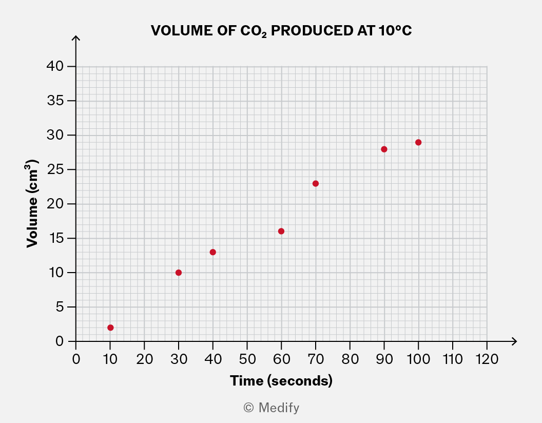
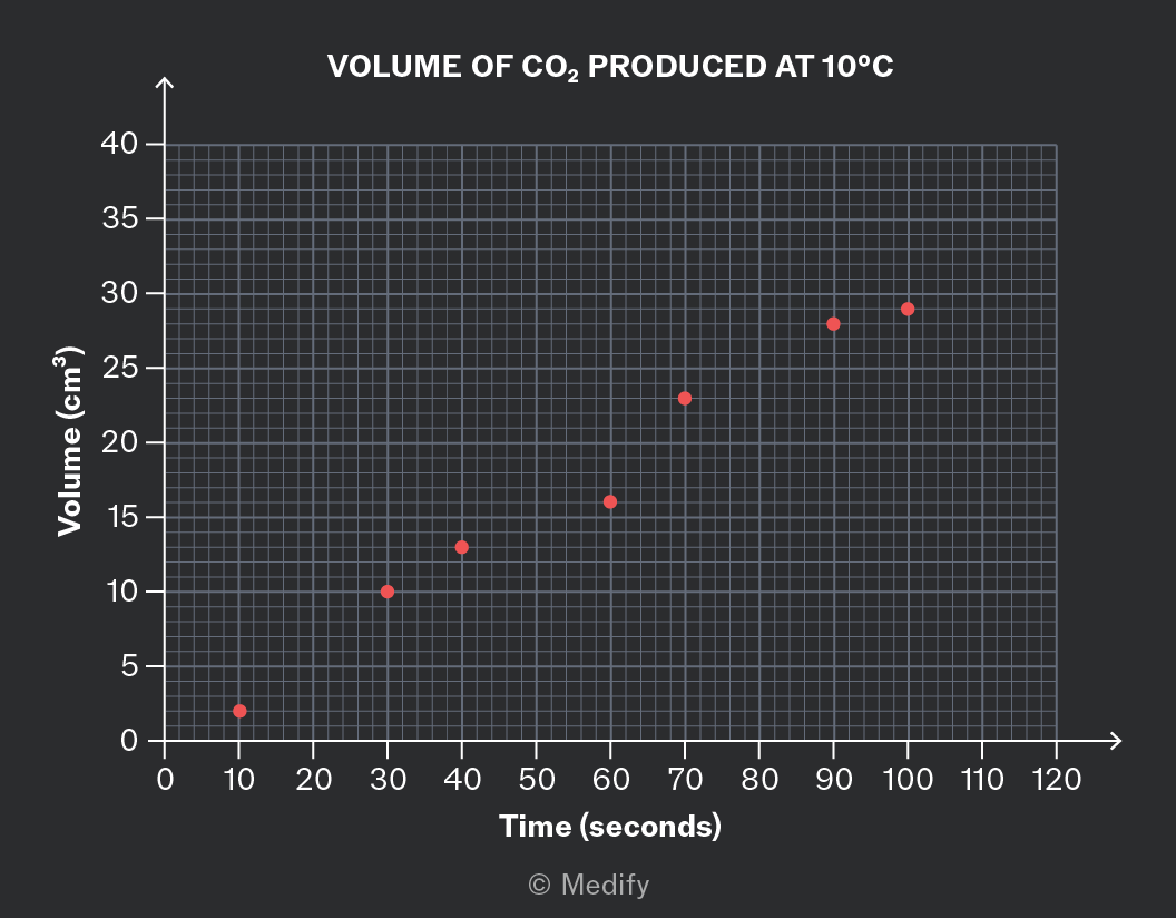
,

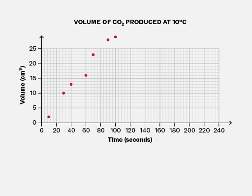
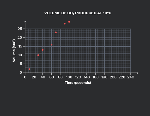
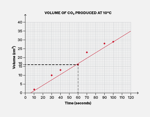
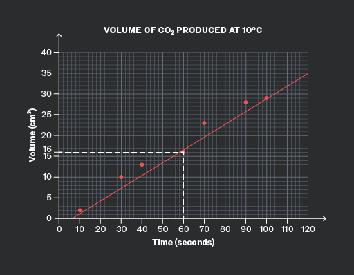
This graph shows the approximate volume of gas produced two minutes after the experiment started.

This graph has a clear title and axis labels, which allow us to answer questions like this confidently.

It is important to note that you may lose marks in your exam if you draw a graph that omits these features.

Add to favourites

When plotting a graph, the axes are determined by the variables in an experiment.

  • x-axis – independent variable (the thing that is changed)
  • y-axis – dependent variable (the thing that is measured).
Add to favourites

To make your graphs easy to read, it is important to choose suitable scales for both axes.
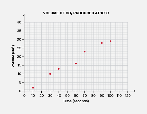
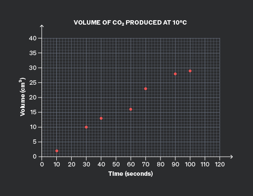
A graph titled 'VOLUME OF CO2 PRODUCED AT 10°C'. The x-axis is labeled 'Time (seconds)' with values ranging from 0 to 120 at intervals of 10. The y-axis is labeled 'Volume (cm³)' with values ranging from 0 to 40 at intervals of 5. Seven red markers are plotted: approximately (10, 3), (20, 7), (30, 10), (50, 15), (70, 20), (90, 27), and (110, 30).
Do

Choose suitable scales for the axes, so that the data fills most of the height and width of the graph area, and none of the data points are outside the area.

A graph titled 'VOLUME OF CO2 PRODUCED AT 10°C' shows the volume of CO2 in cm³ on the y-axis and time in seconds on the x-axis. The y-axis is labeled 'Volume (cm³)' with increments of 5 up to 25. The x-axis is labeled 'Time (seconds)' with increments of 20 up to 240. Seven red markers are plotted on the graph: approximately (0,0), (20,5), (40,10), (60,15), (80,18), (100,22), and (120,25), illustrating an increasing trend.
Don't

Choose scales for the axes that are too wide, like the horizontal axis here. It cramps the data and risks inaccuracy when reading values and drawing trendlines.

Choose scales too narrow so that data points fall outside the graph area, like the vertical axis here.

Add to favourites

To make your graphs easy to read, it is important to choose suitable scales for both axes. It is usually best to use multiples of values related to British coins and notes, such as 1, 10, 100, …, 2, 20, 200, …, 5, 50, 500.
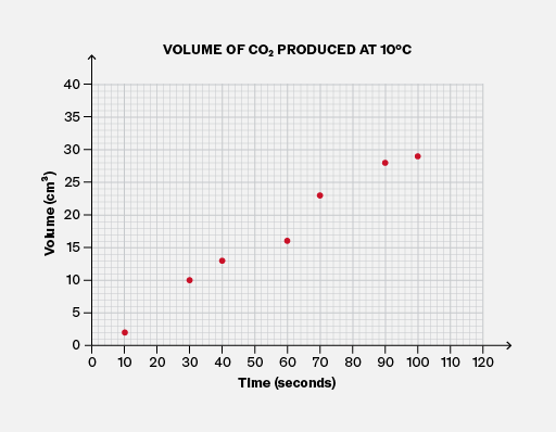
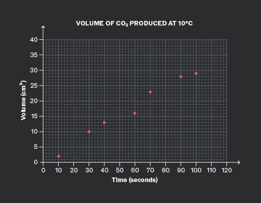
A graph titled 'VOLUME OF CO2 PRODUCED AT 10°C' with 'Volume (cm³)' on the y-axis and 'Time (seconds)' on the x-axis. The y-axis ranges from 0 to 40, and the x-axis ranges from 0 to 120. There are eight visible red markers plotted on the graph: approximately at (10, 3), (20, 7), (30, 9), (40, 14), (60, 18), (80, 25), (90, 28), and (110, 32). The plotted points show an upward trend over time.
Do

Choose a simple multiple to use on both axes.

Here, the horizontal scale uses multiples of 20, and the vertical axis uses multiples of 5.

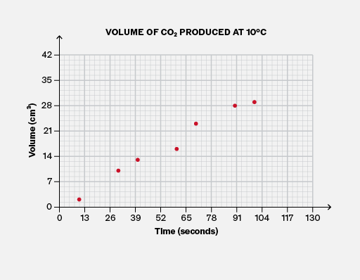
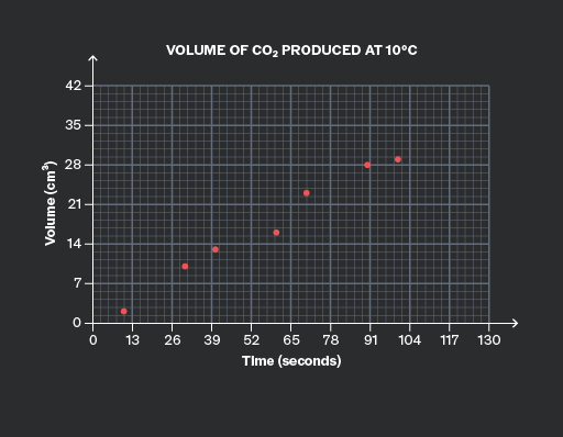
A graph titled 'Volume of CO2 Produced at 10°C'. The x-axis is labeled 'Time (seconds)' with values from 0 to 130. The y-axis is labeled 'Volume (cm³)' with values from 0 to 42. There are seven plotted markers: approximately (13, 4), (26, 8), (39, 14), (52, 18), (65, 21), (78, 28), and (104, 32).
Don't

Choose inconvenient multiples for either axis.

Here, the horizontal axis uses multiples of 13, and the vertical axis uses multiples of 7.

Both axes are difficult to read. Try reading the middle data point! This could waste time and cause errors in an exam situation.

Add to favourites

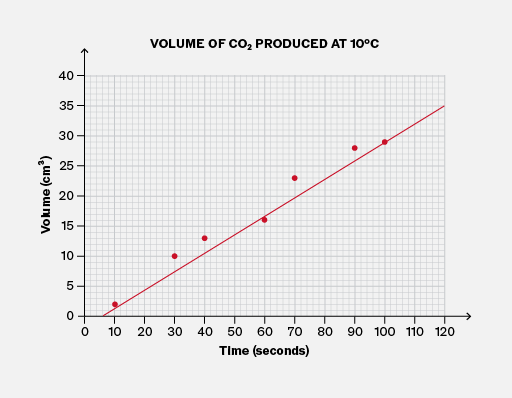
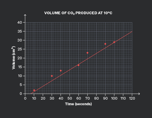
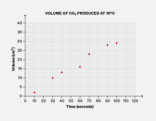
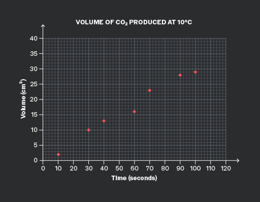
Lines of best fit (and curves) usually have a similar number of data points above the line (or curve) as below it. If you draw a line of best fit for which this is not true, you should reconsider whether it is accurate!

It is useful to know that in very few extreme cases, the number of data points above and below the line of best fit could be quite different. But this is rare!
,
Do

Ensure there is a similar number of data points above and below the line of best fit.

Here, four points are above the line and three points are below it, which is quite balanced.

,
Don't

Allow an imbalance between the amount of data above the line and below the line.

Here, only one of the seven points is below the line, so it is unlikely to be suitable for the line of best fit!

Add to favourites

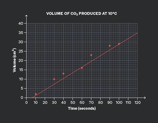
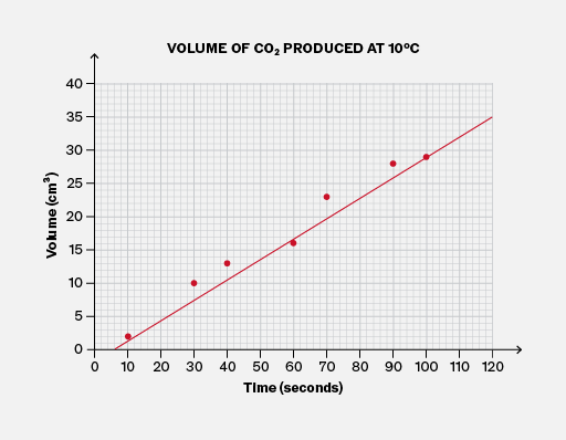
You must draw lines of best fit accurately, as you may need to read precise values from them. Therefore, it is important to use a ruler or other straight edge.

Make sure you bring one to your exam!
,
Do

Use a ruler or straight edge when drawing a line of best fit.

,
Don't

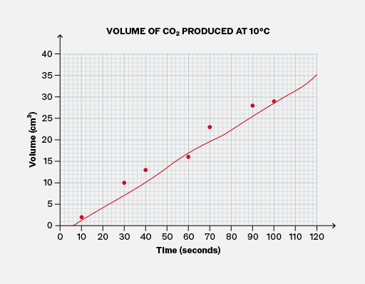
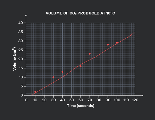
Attempt to draw a freehand line of best fit; it will probably not be accurate! You could lose easy marks for carelessness.

Add to favourites

For data that follows a linear trend, you should draw a straight line of best fit through the data, using a ruler.

Never join the data dot-to-dot unless you are sure that the trend is not linear. For example, monthly climate data does not follow a linear trend.

Add to favourites

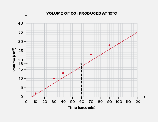
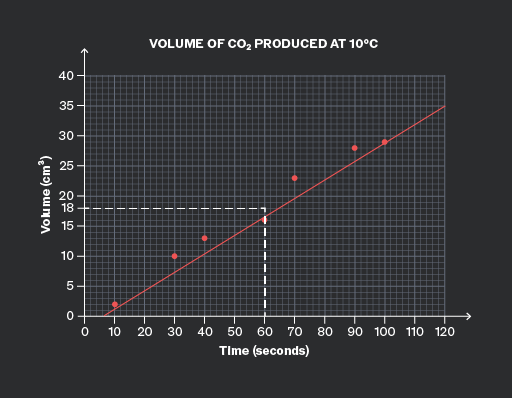
It is important to note that exam questions may ask you to interpolate, estimate, or predict values from a graph that shows a clear trend.

You should do this by drawing a line of best fit (or the curve) and reading values from that, rather than reading individual data points.

This is because the data points will fall above or below the line (or curve) due to unrelated factors (known as “noise”), such as human error. The line (or curve) reduces the effect of this noise.
,
Do

Use the line of best fit to directly estimate any values on the graph. This reduces the impact of noise in the data.

,
Don't

Don’t ignore the line of best fit when the question asks you to interpolate, predict, or estimate values.

Add to favourites

Question walkthrough

Draw a line of best fit to extrapolate from data.

Draws a line of best fit through weight-extension data for an elastic fibre, then extends it to the y-axis to find its natural length when no weight is attached.

Question walkthrough

Draw a curve to extrapolate from data.

Draws a smooth curve of best fit through non-linear data, then uses it to extrapolate a prediction for lemonade sales at a forecast temperature.

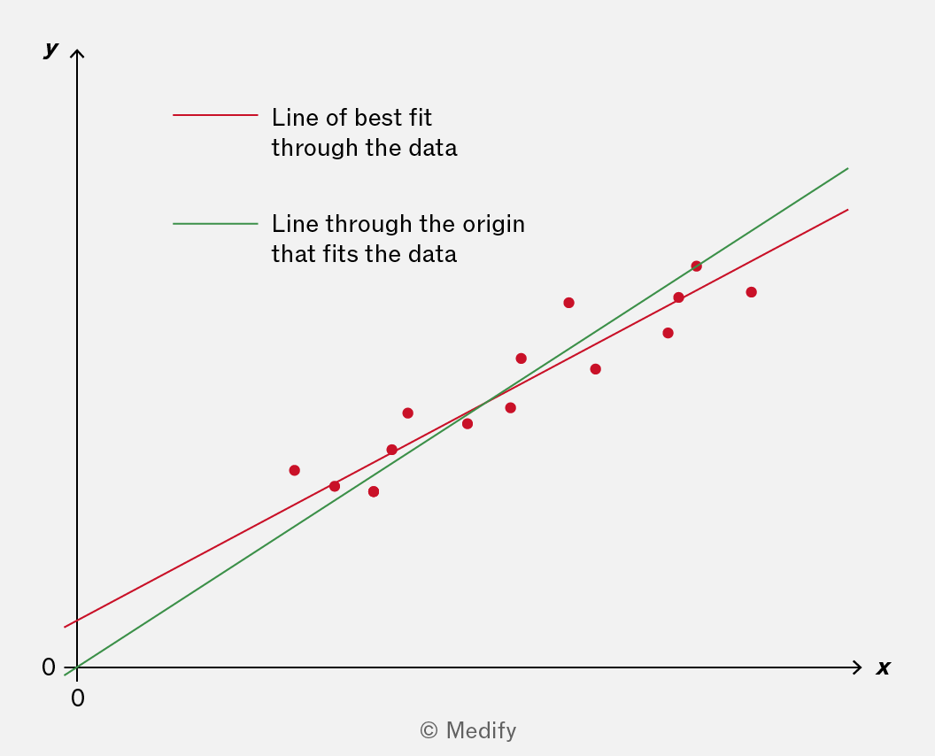
In some scientific contexts, it is clear that any line of best fit (or curve) must pass through the origin. Some examples of where the graph must pass through the origin:

  • In Biology and Chemistry, in rate–concentration graphs, because when the concentration of the reactant is zero, the reaction does not happen.
  • In Physics, stress–strain graphs, because when no force is applied to the material, the material has zero deformation.
  • In any context, when a quantity has an initial value of zero.

You should use your scientific understanding to identify these cases and ensure that any line of best fit (or curve) passes through the origin.

It is important to note that in many other scenarios, there is no reason to expect that the line (or curve) would pass through the origin.
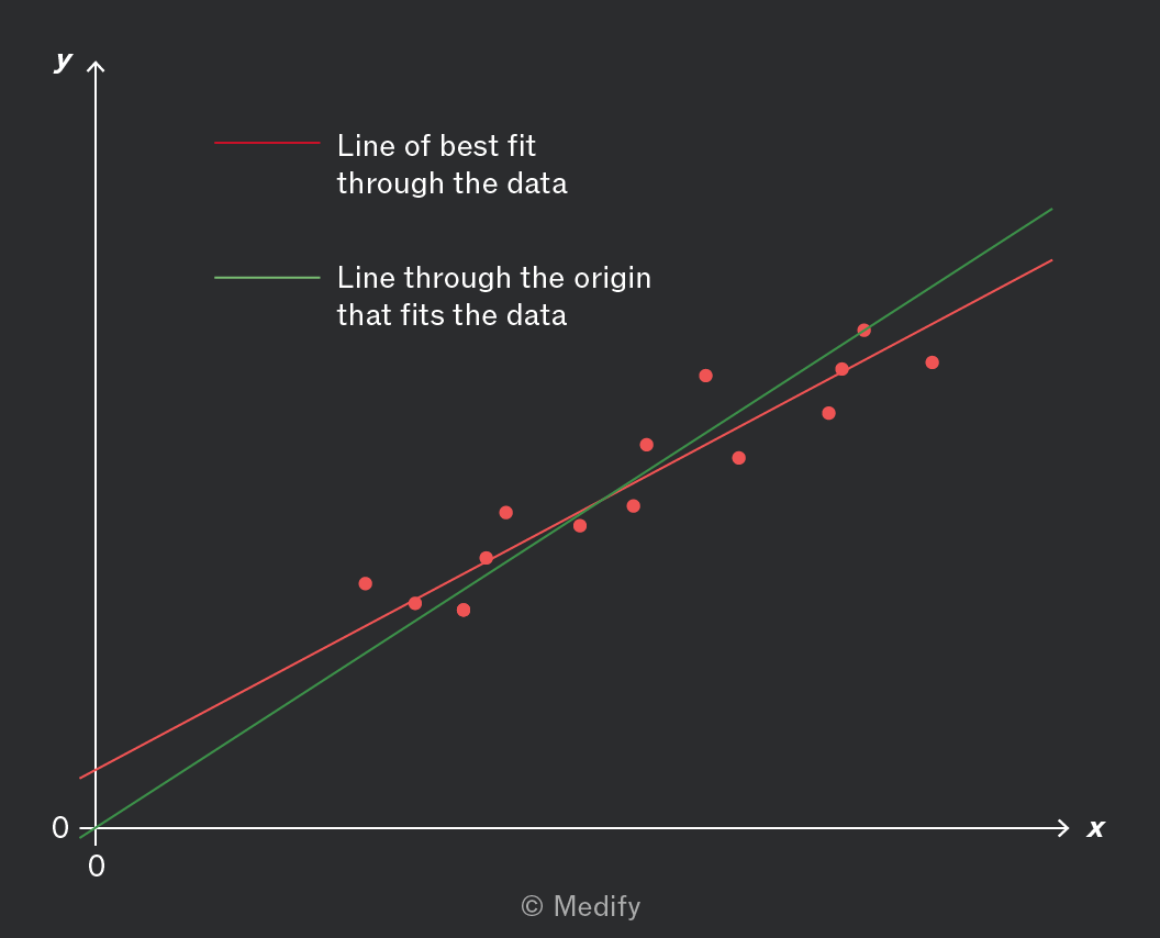
,

For the data in this graph, which of the two lines should you use? It depends on the scientific context. You will need to choose!

Add to favourites

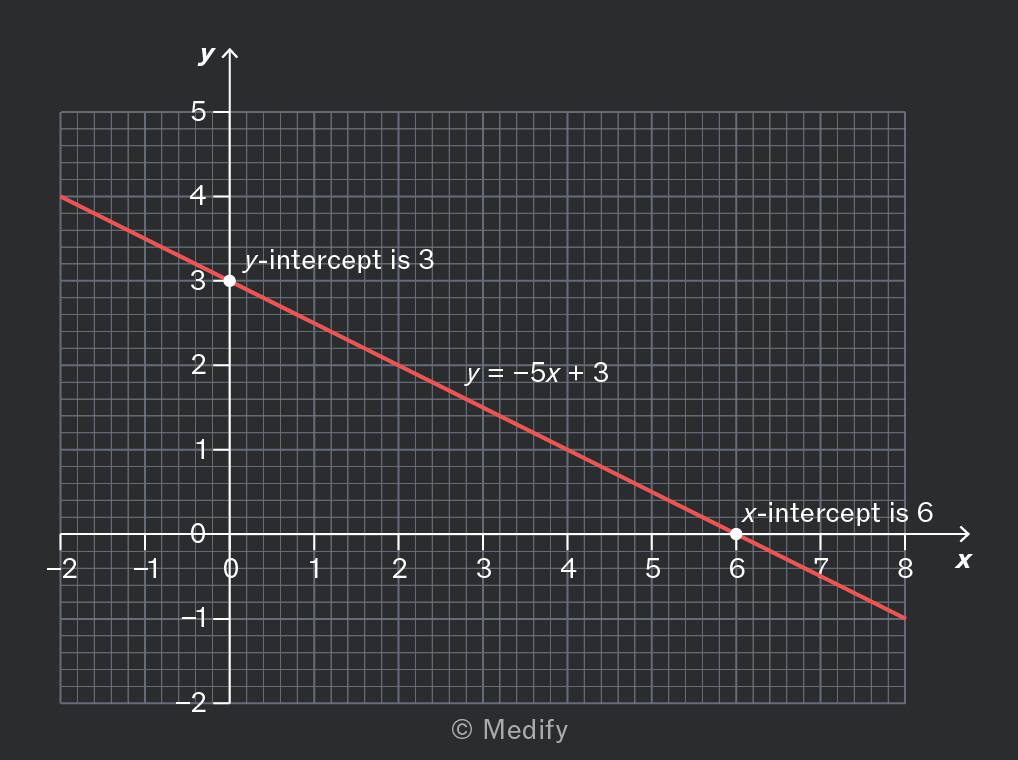
Where a straight-line graph crosses an axis, the crossing point is called an intercept.

The point where the graph crosses the vertical y-axis is called the y-intercept. This is often given the value when writing the equation of the straight line:

The point where the graph crosses the horizontal x-axis is called the x-intercept.
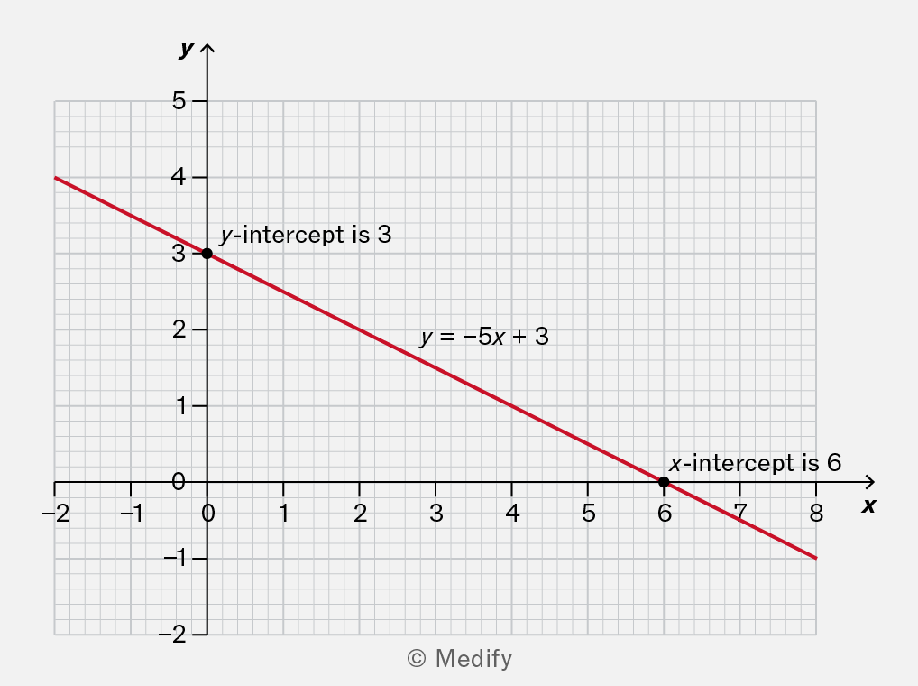
A graph showing a linear equation with a red line. The y-intercept is marked at 3, and the x-intercept is marked at 6. The equation of the line is y = -5x + 3.

Here, the y-intercept is 3, and the x-intercept is 6.

Add to favourites

Question walkthrough

Understand that y = mx + c represents a linear relationship

Translating an equation from numerical form to graphical form.

To calculate the gradient of a graph, choose any two points and calculate:

If the two points are and the same expression can be written:

However, your answer may be inaccurate if you divide by a horizontal change that is too small. To avoid this, choose two points that are quite far apart.
A graph with a red line representing a linear function, plotted on a grid. The x-axis ranges from 0 to 25 and the y-axis from 0 to 15. Two points are marked: one at (20, 9.5) with a green dot and another at (20, 1.9) with a green dot, connected by a vertical line. A blue horizontal line is drawn at y=20.
Do

Calculate the gradient using points that are far enough apart.

This is close to the true value of 0.383.

A graph with a red line representing a linear function plotted on a grid. The x-axis ranges from 0 to 25 and the y-axis ranges from 0 to 15. Two points are marked on the graph: one at (20, 9.5) and another at (20, 1.9), with green dots indicating their positions. A blue horizontal line is drawn at y = 20.
Don't

Calculate the gradient using points that are too close.

This is not accurate because the true value is 0.383.

Add to favourites

If a straight-line graph is sloping downwards, the gradient is negative.

You should use the same procedure to calculate the gradient, but make sure that the vertical change is negative because it’s a decrease.
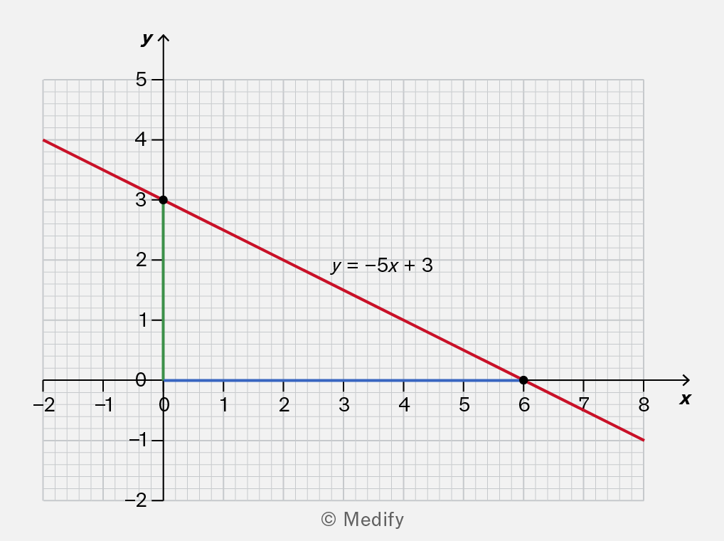
A graph showing a linear equation y = -5x + 3. The y-axis is labeled with values from 0 to 5, and the x-axis is labeled with values from -2 to 8. The line intersects the y-axis at (0, 3) and the x-axis at (6, 0). The graph includes a grid for reference.

Add to favourites

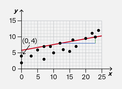
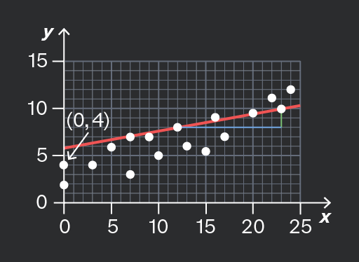
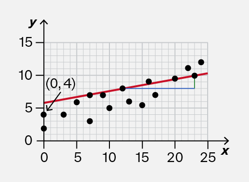
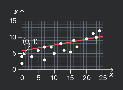
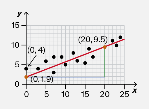
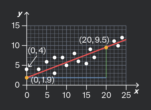
Sometimes you will be shown a graph of data from an experiment. The points follow a linear trend, and a (straight) line of best fit may be used to illustrate the trend.

When estimating the slope and intercept of this graph, use the line itself, not the individual data points.
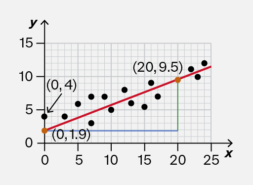
A scatter plot showing data points represented by black dots on a grid. A red line indicates the trend line, with coordinates labeled at two points: (0, 4) and (20, 9.5). A green vertical line and a blue horizontal line connect the point (20, 9.5) to the x-axis and y-axis, respectively. The origin (0, 0) is marked, along with the point (0, 1.9) on the y-axis.
Do

Use the line of best fit to calculate the slope (gradient) and intercept.

Here, the y-intercept is approximately 1.9, and the slope can be calculated accurately from points such as (0, 1.9) and (20, 9.5).

A scatter plot with a red trend line showing a positive correlation. The x-axis ranges from 0 to 25 and the y-axis from 0 to 15. Two specific points are labeled: (0, 4) with an arrow pointing to it, and (0, 1.9) marked with an orange dot. Another point (20, 9.5) is also indicated on the trend line.
Don't

Use individual data points to calculate the slope and intercept.

Here, the y-intercept is not 4; it’s approximately 1.9. The slope cannot be estimated accurately by using the two data points shown.

Add to favourites

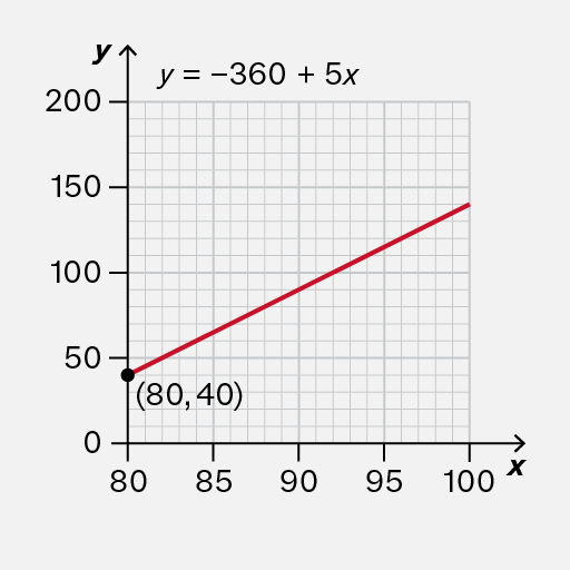
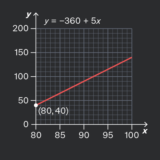
On most graphs, the horizontal axis starts at and therefore the y-intercept is on the vertical axis.

However, sometimes the horizontal axis is drawn differently. In these cases, you would need to do some further calculations to determine the y-intercept.
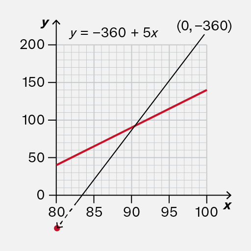
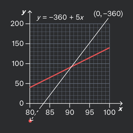
A graph showing a linear equation y = -360 + 5x. The x-axis ranges from 0 to 100 and the y-axis ranges from 0 to 200. A red line represents the equation, intersecting the y-axis at the point (0, -360). A point is marked on the x-axis at approximately 80.
Do

Notice that the y-intercept is not shown on this graph.

In fact, it is −360, which would require some effort to calculate.

A graph showing a linear equation y = -360 + 5x. The x-axis ranges from 80 to 100 and the y-axis ranges from 0 to 200. A red line represents the equation, with a point marked at (80, 40).
Don't

Attempt to read the y-intercept off the vertical axis, because on this particular graph, it is not aligned with

The y-intercept is not 40.

Add to favourites

Question walkthrough

Determine the slope and intercept of a linear graph

Using a drawn slope to determine a derived quantity from a linear graph.

You may be asked to find the gradient of a straight-line graph, which is also known as the slope of the graph.

The gradient illustrates a rate of change, so some exam questions may use phrases similar to this instead. You need to recognise phrases about rates and interpret them as the gradient of a graph, if relevant.

For example, a question might show a graph of concentration against time, and ask about the rate of increase or rate of decrease of the concentration.

Add to favourites

If a straight-line graph has a positive gradient (it slopes upwards), then it shows a rate of increase.

If a straight-line graph has a negative gradient (it slopes downwards), then it shows a rate of decrease.

If the gradient of the straight line is zero (it is horizontal), then it shows that the quantity is not changing – it is constant.
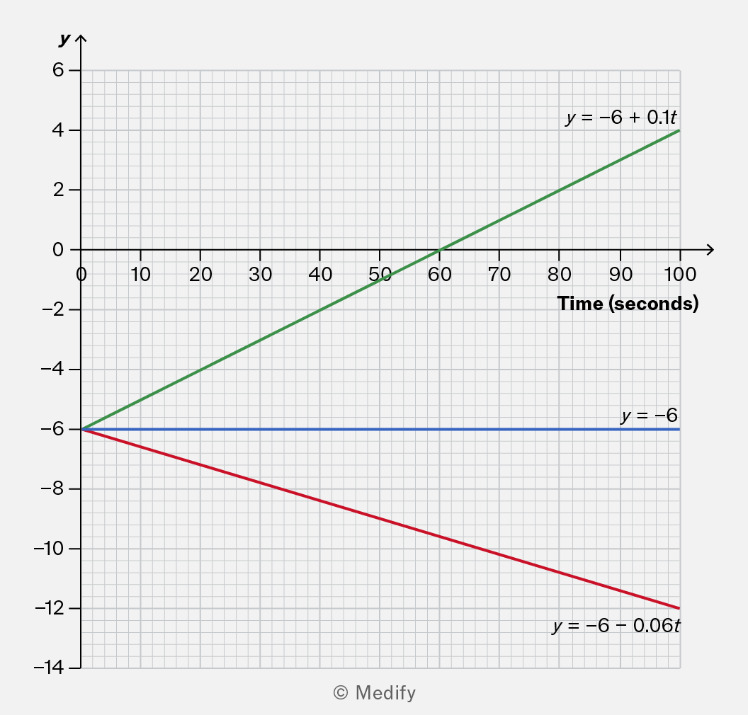
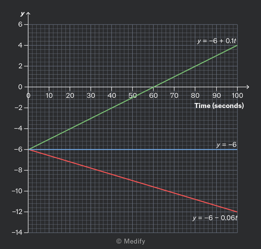
A graph showing three linear equations plotted against time in seconds on the x-axis and y-values on the y-axis. The green line represents the equation y = -6 + 0.1t, the blue line is y = -6, and the red line is y = -6 - 0.06t. The graph includes a grid for reference.

The green line has a gradient of 0.1. It shows an increase of 0.1 units per second.
The blue line has a gradient of zero. It shows that the quantity is constant.
The red line has a gradient of −0.06. It shows a decrease of 0.06 units per second.

Add to favourites

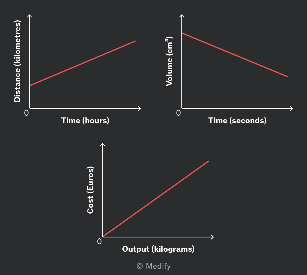
The units for a rate of change can be written in words by arranging the units from the axes:
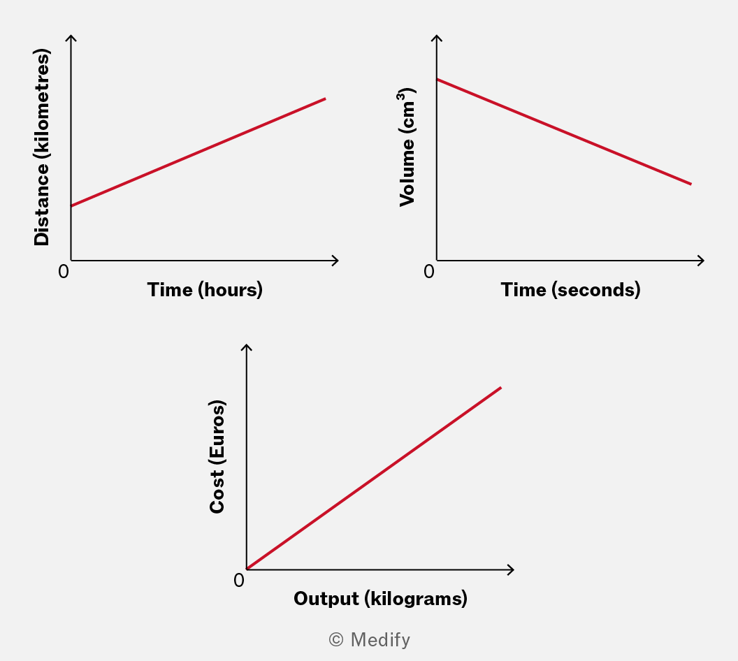
Three graphs illustrating different relationships: the first graph shows a linear increase in distance (kilometres) over time (hours), the second graph depicts a decrease in volume (cm³) over time (seconds), and the third graph represents a linear increase in cost (Euros) relative to output (kilograms).

Examples of this include:

  • kilometres per hour (or or )
  • cubic centimetres per second (or or )
  • Euros per kilogram (or € or €)

As noted in the examples, you may abbreviate these units in various ways to reduce the amount you need to write.

Exam boards generally accept both formats because they’re both scientifically correct ways to express the same thing. The key is being consistent and clear in your notation.

Add to favourites

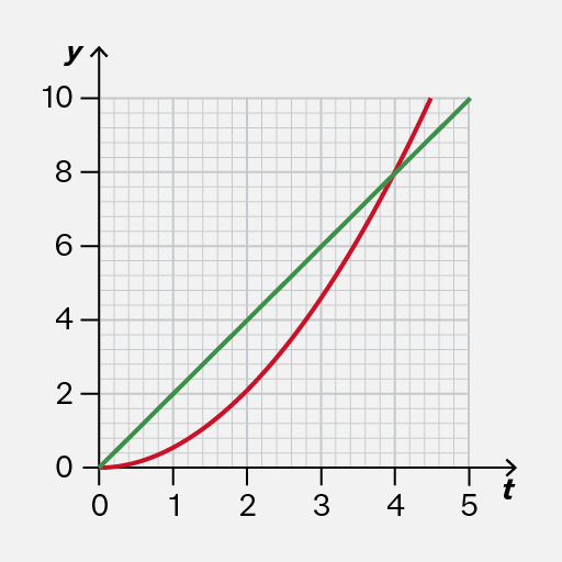
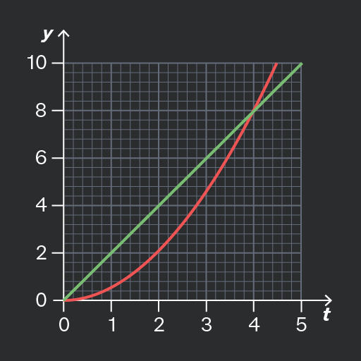
On a straight-line graph, the gradient is the same everywhere. The graph describes a quantity that always changes at the same rate.

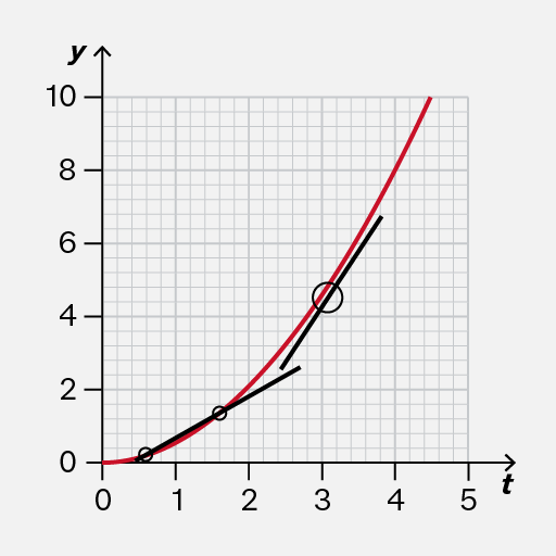
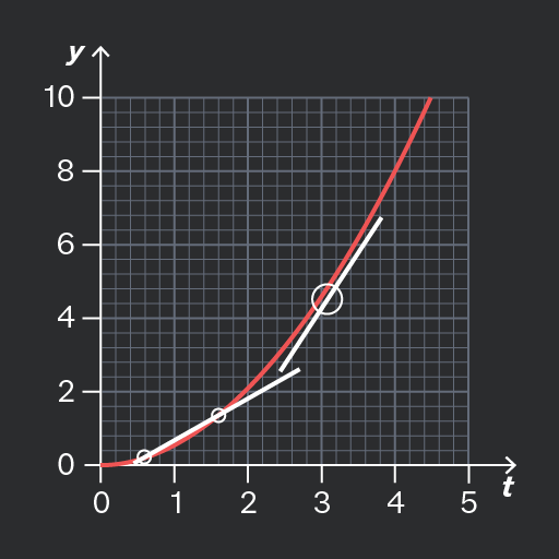
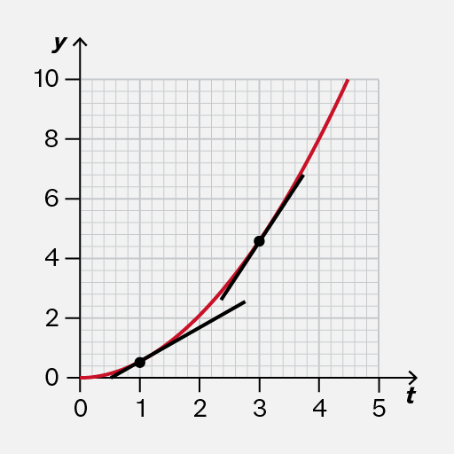
On a curve, the gradient is changing. The curve doesn’t rise or fall evenly; it changes based on the X-axis value.
,
Do

Recognise that the gradient is changing.

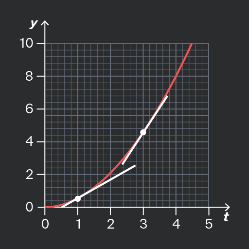
The tangent lines in this example illustrate that the rate of change is greater when than when

,
Don't

As the gradient is changing, do not use the straight line between any two points (such as and as shown on the image) to represent the rate of change at any moment.

Add to favourites

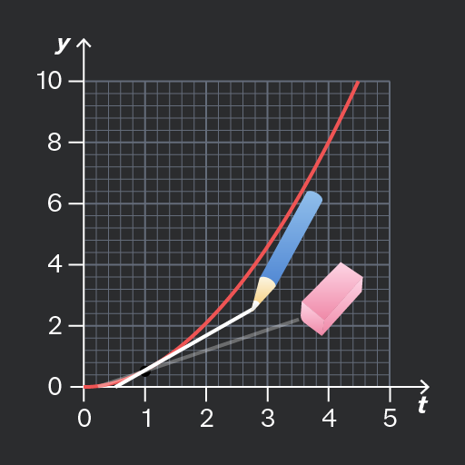
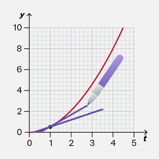
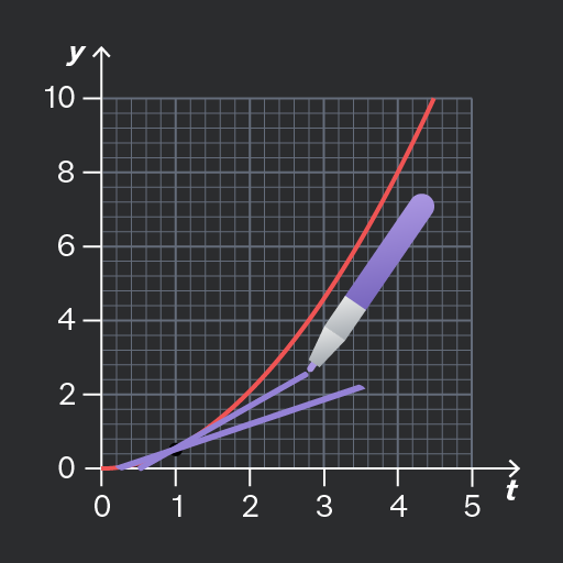
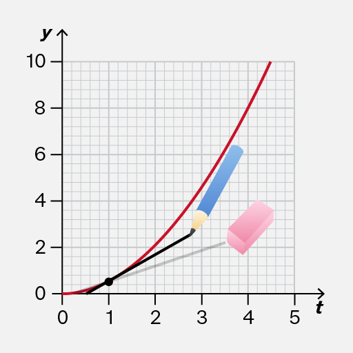
Sometimes, your first attempt at drawing a tangent line may not be accurate. For example, the tangent line could cross the curve.

If that happens, you should erase the inaccurate tangent line and try again.

You should use a pencil so that it is convenient to erase a line if necessary.
,
Do

Use a pencil so that it is convenient to erase a line if you have not drawn it accurately.

Then you can try again to draw a better tangent line.

,
Don't

Don’t use a thick pen because if your original attempt at a tangent line is inaccurate, you might not be able to see the original graph clearly to redraw an accurate line!

Add to favourites

It can be difficult to draw the tangent line accurately! It should touch the curve without crossing it.
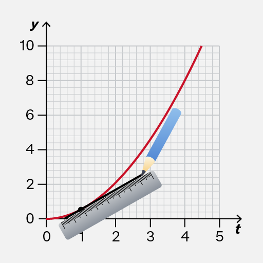
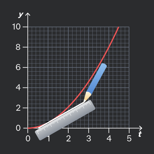
,
Do

Carefully position your ruler about away from the curve to account for the width of your pencil.

,
Don't

The tangent should not cross the curve, nor leave a gap. Otherwise, it would be difficult to check whether your line has the same gradient as the curve.

Add to favourites

Question walkthrough

Draw and use the slope of a tangent to a curve as a measure of rate of change

Uses a tangent to a curve to estimate the instantaneous speed of a machinery component at a given time, by drawing the tangent and measuring its gradient between two points.